
How to Use Contrasting Colors to Add Punch To Your Images
There are loads of different ways to use color in photography, but for this particular post we are going to look and how we can convey contrast using color. This is often called chromatic contrast, but personally I think it’s easier to use the term complementary or contrasting colors - but either is good :)
Here's a useful guide on how we can use this to add interest to our images!

What are Complementary Colors?
Complementary colors are those that are found on opposite sides of the spectrum on the color wheel. Just imagine drawing a line between one color and the one directly opposite it and you have your complementary colors!
The Color Wheels
Although I am tempted to keep it simple but just showing just one color wheel, I do want to point out that there are actually different variations of the color wheel, which is hardly surprising, given the amount of colors in the world! For example, the color wheel on the left shows "traditional" opposing colors - red is the opposite of green and purple is the opposite of yellow. But here is another wheel which is a slight variation - in that wheel red is the opposite of cyan and purple / magenta is opposite green (If you are thinking that sounds like using CMYK ratios in Photoshop, you are absolutely spot on!)

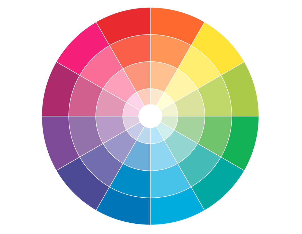
Regardless of which wheel you look at, you will see that although the direct opposite colors are slightly different with each color wheel, there are definite similarities between the wheels: greens twin with reds and purples, oranges with blues / greeny blues, and yellows with purples and blues. For our purposes, it doesn’t matter a jot which color wheel you use, since they are all considered complementary - so feel free to explore!
Some Examples...
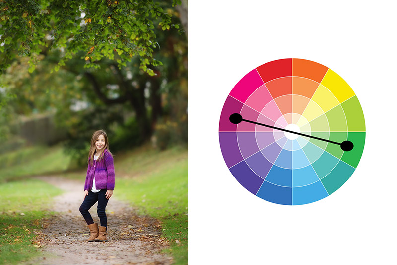
Here are some images that use complementary colors, to give you an idea of how this works in practice.


The Ratio of Each Color
Regardless of which color wheel you use, using equal amounts of complementary colors can be a little overpowering and sometimes leave the viewer with no clue about what to focus on. Therefore, it’s can be best to have one color taking up more “space” in the image, with the second color taking up a smaller amount. There is no exact rule to the ratios of this, but if you reckon on filling the frame with around 2/3rds with one color and 1/3rd of the frame in the second color, you should end up with a pleasing image. That said, even just flecks of two complementary colors against a neutral background can make an interesting image, or even just using a shade of lipstick that is of a complementary color to a dress can be enough to add interest. It really just does depend on how bold you want the overall image to be!
Have fun choosing your colors!
KEEP READING!
Composition Tip - Use Triangles
Photography Composition - Get Creative With Angles!