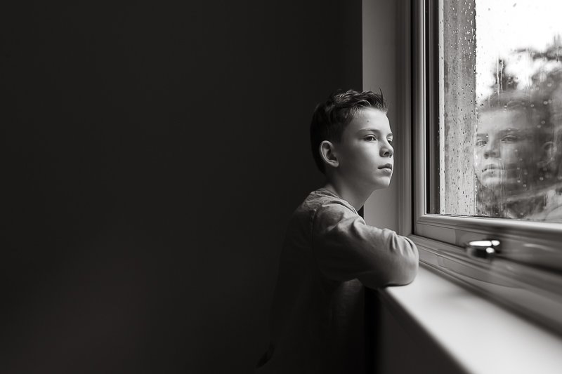
What NOT to wear for Photos - The 3 Colours to Avoid

Have you ever wondered about what colours you should have your subject wear for photos…..or if there’s any colours that you should AVOID?
Although you can use any damn colours you wish, there are three colours (or actually, “sets” of colours!) that will simply make your job harder as the photographer, because they tend to “clip” easily - which is simply a way of saying that you’ll lose all detail in that particular area.
Wondering what they are….?!
Hit play on the video below to find out!
Grab your Manual Mode Cheat Sheet here!
-- LINKS & RELATED CONTENT --
► Grab Your Free Manual Settings Cheat Sheet
► Join the Live Snap Love Mailing List!
Once you’ve had a chance to watch, I’d love to hear from you!
Leave a comment below and let me know which colours you LOVE having your subjects in, and if there are any other colours that you avoid!
As usual, thank you so much for watching, sharing our videos and blog posts, and joining in the community by sharing your thoughts and ideas.
Want easy to understand tutorials, actionable insights, behind-the-scenes secrets, exclusive guides, workshops and SO MUCH MORE delivered direct to your inbox? Then join our mailing list here!