
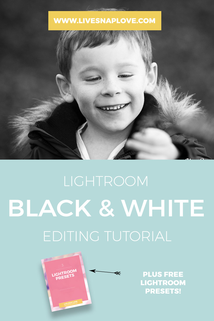
Creating a Black and White Conversion In Lightroom
For many images, I find myself drawn to the simplicity of black and white – particularly those with good tonal ranges or dramatic light. (you can read more about which images are great candidates for black and white conversions here)
The good news is you can do an awesome conversion in Lightroom, and I'm going to show you how to do it!
Without further ado, here's a guide to how I create my black and white images when using Lightroom only.
Before I start, let me just firstly tell you that you that I have a FREE Lightroom Starter Kit which has everything you need to get started with Lightroom, including three presets! One of these gives you the black and white conversion I'm going to lay out for you here! Grab it by going here!
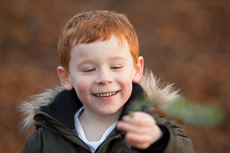
Right, let's get started! Let's have a quick look at the original, straight out of camera image that we are going to work on for this tutorial.
Step One: Convert to Black & White
To begin with, switch to black and white to get your initial conversion. You will find this option at the top of the Basic Panel, as circled below.

This immediately creates a black and white image, but one that is lacking in any punch - as you can see here. It's OK, just it a bit "meh".

Step Two: Add Overall Contrast
So the next step is always to add in some overall contrast. Contrast is simply the difference between the dark and light areas in your images. When we add contrast, we are basically deepening the blacks and shadows, and lightening the whites and highlights.
We can start this process by using the sliders which control the blacks and the whites. By moving the whites and blacks sliders, we can introduce more overall "pop" and contrast to the image.
You can also play with the highlights and shadows sliders to get the look you want. Obviously, don't go so far with these sliders that you introduce "clipping" - where you start to lose detail in the brightest or darkest parts of your image.

By doing so, you can see that I've introduced a bit more life to the image. It's better, but still not great, so we'll bash on


Step Three: Add more contrast!
Next, we can take it a step further by adding secondary contrast. We can do this in one of two ways. The first is the easiest option, where you simply need to move the contrast slider. What’s important to note here is what this does – it doesn’t touch the ends of the histrogram, it simply adds secondary contrast by adding contrast to the midtones of your image.

You can also do this a second way, by using the Tone Curve Slider in LIghtroom and adding a slight S curve. This has the same affect – it leaves the ends of your histogram (the black and whites) alone, but adds contrast to the midtones only. This can be a better option if you want to further fine tune how much contrast you apply to either the lighter or darker midtones.

You should at this point have a great black and white image! Here's mine"

Psst....if you want to make life REALLY easy on yourself, you can have all this done for you via a preset. Presets run through a series of actions for you, like the ones above, so you don't have to keep manually applying them to each image.
You can get your hands on my 4 Free Lightroom Presets in my LIghtroom Starter Kit: a contrasty black and white like I'm showing you here, and a matte Black and White! You can also get a simple color pop preset.
Step Four - Add Clarity
If we want to, we can fine tune this either further, by adding some clarity. Clarity is actually pretty similar to contrast, except that it is adding contrast to the detail in your image to make it stand out more. Be careful when adding clarity to images of people, they can start to look “crunchy” pretty darn quick!

Step Five - Play with the B&W Luminance Sliders
Lastly, you can use the luminance sliders in Lightroom. All these sliders are doing is adjusting the brightness of a particular color. So, for example, to boost the brightness of the skin only, you can add luminance to the oranges, reds and yellows (all depending on skin tone) If your son or daughter is wearing clothing that is not helping the image along (either by being too dark or light) then you can tweak that in Lightroom simply by moving the appropriate color slider - if you are not sure, have a play with all the colours to see if they affect anything!

I didn't actually change much in this particular image, but in some cases these sliders can make a dramatic difference! Here's the final image here:
