7 Deadly Lightroom Photo Editing Sins (and how to avoid them)
When I first started learning how to edit my photos, I followed a few different tutorials online, patched them together, and studiously applied them to each and every photo.
The result?
Eye blindingly bright, overly contrasty and saturated images, that looked like they had been edited by 10 different people.
(My eyes hurt just THINKING about those early edits 😎😵)
But you don’t have to make those mistakes too, because you’ve got me, and I’m not gonna let that happen!
So without further ado, here’s 7 deadly photo editing sins - and most importantly, how you can avoid them.

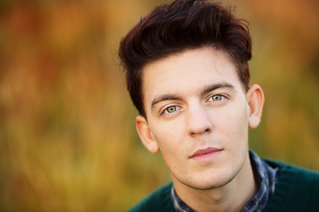
1) Going overboard on your portraits
I’m all for giving skin a little subtle soften and glow, and adding a little extra sparkle to the eyes, but you really must keep it looking really natural.
You never want someone to look at a photo and think that the person looks like Ken or Barbie, or like an alien from outer space with weirdly bright eyes - you want them simply to look like the very best version of themselves. If you notice the skin softening or eye enhancement FIRST, then you’ve made that the focal point of the image, not the person - and defeated the whole point of the photo.
This image does exactly that - the skin has been smoothed out so you can’t see any texture whatsoever, and no-one’s eyes are that naturally white….

Always do any portrait enhancement with a really soft touch - my little trick is to do the edit at full power, and then dial it back to where it looks normal…..and then take a bit more off again. This usually helps find the edit hit the perfect spot. This image below looks much more natural, even though a small amount of portrait enhancement has been applied.

2) Over-sharpening your photos
We all love a sharp photo. It’s why we spend hours trying to figure out why our photos are soft, and pixel peep our images (usually wishing we could get the top-of-the-range L lens to help 😁)
Because of this desire to get really sharp photos, we can all be guilty of taking sharpening in post processing one step too far.
The problem is, when we over-sharpen, it can result in a weird kinda halo around the edges of certain areas, plus you also sharpen the NOISE in the image. So an image with even relatively low noise can look 1000% worse when you apply sharpening, like this:

If you are being heavy handed with sharpening to try to make an out of focus image sharp, know this: it can’t be done. You cannot bring something that is out of focus into focus. Sure, you can bring an ever so slightly soft image to a level that will pass most people’s inspection, but you cannot bring a soft out of focus back by sharpening.
So go easy on the sharpening slider, and remember: always sharpen your image for it’s intended purpose. That means sharpening should be done LAST to your image, and when you know what you are doing with it.
(Not sure which editing steps you should be taking on your image? Then be sure to grab our FREE Lightroom Starter Kit and get a step by step editing checklist, plus a whole host of other Lightroom goodies too!)

3) Going overboard with the saturation slider
Using saturation on certain images, especially portraits, can give you really weird and overdone results. For many images, it can be better to use Vibrance instead.
Although there is more complicated ways to think about it, in simple terms, Saturation boosts ALL the colours in the frame equally, whether they could do with being more vivid or not. Vibrance on the other hand, is more intelligent, and will give the already highly saturated colours less of a boost, and give more attention to those that are less saturated.
You can see this in action here - this first example, we’ve used Saturation at +30 and you can see that the colours are unrealistically bright, and it’s made the skin tone look really orange (like a bad fake tan job)

In this second example, instead of saturation, we’ve moved the vibrance slider to +30 and you can see that there has been a boost of colour, but that the skin tone looks a lot more natural.

4) Thinking that presets or actions are magic bullets
I have seen so many people buy presets because they love the before and after images shown on the sales page, and they want their images to look just like that....
....But when they use the presets on their OWN images, the results look nothing like they hoped for, or worse, just plain weird 😀
The reason for this is because presets should ideally only be used to save you TIME editing your images, not as substitute for learning how to edit.
However, once you learn the foundational editing steps, AND you know how to use some of the tools within LIghtroom, presets can be an amazing way to fast track editing your images beautifully.
In our step by step program, Edit Like A Pro in Lightroom Classic we teach you how to carry a full end to end edit on your photos, what steps you need to take, how much to move a slider by, and the questions you need to ask yourself to know whether an image would benefit from particular edit or not, so that you have ALL this knowledge, and can THEN speed it up with presets if you wish!
5) Being heavy-handed with the vignette
Personally, I love the occasional vignette, and it can be a really useful way of bringing your viewers eyes to the main subject of the image.
First of all, not every image needs a vignette - it works on some images, and not on others.
If you do decide that your image could do with a vignette, you have to be super careful not to overdo it - if you can see the vignette before the photo, then you’ve gone too far. Ideally, you don’t even want people to see the vignette at all - that’s how subtle you want it to be!
If you can see the edges of your vignette, like in this first example below, you’ve usually gone too far:

This second vignette is much more subtle: still helping draw the eye to the subject, but not so much that it’s the first thing you see (unless of course you are looking for it)

6) Over-processing in general
A huge temptation for newer photographers is to think that a bad photo can be “rescued” by some serious editing, or that they can simply make up for a lack of expertise or creativity when taking the photo in processing. And that’s when they push the edits so far so that instead of subtly dusting an image with a little fairy magic, they take a creative sledgehammer to it instead.
You know you’ve over processed your image when the editing adjustments detract from the image instead of adding to it - in other words, when people first look at your photo and see the edits, rather that the subject.
There are a few over-processing sins we’ve looked at already (like adding too much vignette, too much saturation, too much sharpening) but the other two major offenders are contrast and clarity.
“Say what?! I thought clarity and contrast were good things!” I hear you say.
They are. But only when used right. Too much contrast and you’ll lose all detail in the black and highlights, create unflattering skin tones and increase saturation to boot.
Go too gung-ho on the clarity slider, and your skin tones will look grey., like this.

Here’s a tip for how to deal with this - always check your “after” photo next to your “before” photo - this will help you see if you’ve gone a bit too overboard on certain areas, or if any important details have been lost through over editing.

7) Not doing any editing at ALL
Editing your images is an important part of the photography process and one that I believe you should at least start to learn as soon as possible.
I know there are some people who think any editing is cheating, but honestly, that’s so untrue. Editing has always been part of the photographic process - back in the days of film, they would lighten and darken areas of the photo (called dodging and burning) to lead viewers eyes around the frame or add contrast when developing the photo. (Of course you can choose to keep photos looking incredibly natural, or go full on with changing out colours and adding effects - it’s entirely up to you!!)
(And yes, we teach you ALL of this in Edit Like A Pro in Lightroom Classic)
Plus, if you shoot in JPEG, your image has already had some editing applied. The camera takes the RAW file, adds some sharpening, saturation, noise reduction, contrast etc, slaps it on your photo at a pre-determined amount (AUTO for editing!) and gives you a JPEG. It’s much better to be in control of that processes rather than letting the camera do it for you!
There are a host of other reasons why you should edit your photos - in fact, I wrote a whole other post about it. You can check out 4 Reasons You Should Be Editing Your Photos right here.
Don’t forget too that you can grab that FREE Lightroom Starter Kit (which gives you full details on what you should be doing in Lightroom) rrriiiighht here!
And there we have it! All 7 deadly sins, and how to avoid them when editing YOUR photos.
One final word: some of what is in this blog post could be considered personal style. I know photographers who love a really hard gritty look to their images, so they use a hard push on the clarity slider. Others love images with over-the-top bright colours, and others yet who love a negative contrast.
But the point is to understand EXACTLY what you are doing when you do this. Photographers who push their colours know which colours are clipping and need to be pulled back. Photographers who like that gritty look with the clarity slider may never use that look on a portrait and so on.
Learn the rules of editing FIRST, then you’ll know when it’s OK to break them.
Itching to learn how you SHOULD edit your photos?
Want to dive deeper into how to make adjustments that suit the photo, and how to really make your images shine without going too far? Then check out my step by step program, Edit Like A Pro in Lightroom Classic
In this easy to follow course, I walk you through every single step you need to take in Lightroom Classic, from start to finish. If Lightroom or editing your photos seems intimidating to you right now, don’t worry, once you have someone walking you through exactly how to use the tools, it becomes incredibly simple! If you’re a beginner, we’ll show you where to start. If you’re ready to get more advanced with your edits, we’ll help with that too :-)